


Firefox 124.0
Mozilla has recently released the Firefox 124.0 Stable along with its 115.9 ESR. This new, updated, stable version of Firefox


Firefox 124.0
Mozilla has recently released the Firefox 124.0 Stable along with its 115.9 ESR. This new, updated, stable version of Firefox


How to Use Your Android Phone as a Webcam on Windows 11?
If you are a student, you might know how important a webcam is when it comes to talking about attending


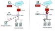
XML vs. JSON
Almost all computer apps that are used nowadays (from desktop to web & mobile) rely on either of these two


Firefox 124.0
Mozilla has recently released the Firefox 124.0 Stable along with its 115.9 ESR. This new, updated, stable version of Firefox

XML vs. JSON
Almost all computer apps that are used nowadays (from desktop to web & mobile) rely on either of these two
Category with a lot of articles


Popular articles


Latest blog articles
Firefox 124.0
Mozilla has recently released the Firefox 124.0 Stable along with its 115.9 ESR. This new, updated, stable version of Firefox

How to Use Your Android Phone as a Webcam on Windows 11?
If you are a student, you might know how important a webcam is when it comes to talking about attending
How to Clear “Other” Storage on iPhone?
Do you use an older phone or a model that doesn’t have a large amount of storage? Then, you could
